Website
Address: eugeneptr.com
There was a PPD session based on website creation and how website should look to stand out. Couples of websites made by the previous years graphic design students were shown as examples. Some of them were very interesting. But the only feature I disliked about them is that they all were made according to one template. I mean they all were different but boring. That very moment I though my website would be totally different, a mess probably, but totally different. Come on, we are creatives, we should stand out. According to Dave Trott: “You should be a “x” in a row of “0”, to be noticed, even if it is stupid.” Another thing that I know is that you should trust yourself in order to create and to develop your own style or you’ll be similar to other and it is worse. So I have started with the creation of front page.
Here it is:
I have used a Cinema 4D program to create those objects. I put some real textures on metal and wooden parts of pencil. It was fun and it was the first time I used Cinema 4D. Learned it according to tutorials on YouTube. Cool program, but complicated. Finished the image in Photoshop.
Second picture of website was inspired by Jif lemon brief we had. I used similar piece of paper to put a logo on existing campaigns. You can find this campaign on my website.
On this page I decided to place intro to my website. Here you can also see the doodle characters/drawings that went through the whole personal branding later.
This is my skills page. Later you can find similar corner pockets for images in my PDF portfolio/CV.
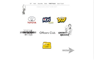
This is my portfolio page. Every page is branded with my personal key logo. I chose grey colour in order to prevent any distraction from the images.
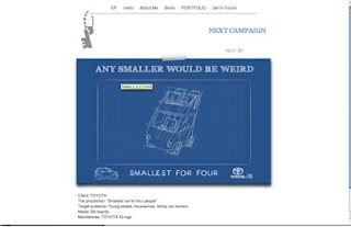
One of my campaigns.
By the way I edited it according to the critics I have received and now I like it better.
This is my contact details information page. I have used Michelangelo’s touch to play visual with words.


No comments:
Post a Comment