Thursday, 17 February 2011

Website


Website

Address: eugeneptr.com

There was a PPD session based on website creation and how website should look to stand out. Couples of websites made by the previous years graphic design students were shown as examples. Some of them were very interesting. But the only feature I disliked about them is that they all were made according to one template. I mean they all were different but boring. That very moment I though my website would be totally different, a mess probably, but totally different. Come on, we are creatives, we should stand out.  According to Dave Trott: “You should be a “x” in a row of “0”, to be noticed, even if it is stupid.” Another thing that I know is that you should trust yourself  in order to create and to develop your own style or you’ll be similar to other and it is worse. So I have started with the creation of front page. 

Here it is:


I have used a Cinema 4D program to create those objects. I put some real textures on metal and wooden parts of pencil. It was fun and it was the first time I used Cinema 4D. Learned it according to tutorials on YouTube. Cool program, but complicated. Finished the image in Photoshop.

Second picture of website was inspired by Jif lemon brief we had. I used similar piece of paper to put a logo on existing campaigns. You can find this campaign on my website.


On this page I decided to place intro to my website. Here you can also see the doodle characters/drawings that went through the whole personal branding later.

This is my skills page. Later you can find similar corner pockets for images in my PDF portfolio/CV.


This is my portfolio page. Every page is branded with my personal key logo. I chose grey colour in order to prevent any distraction from the images.


One of my campaigns.
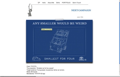
By the way I edited it according to the critics I have received and now I like it better.

This is page with a TV commercial that L.A. and me have created.


This is my contact details information page.  I have used Michelangelo’s touch to play visual with words.


Tuesday, 15 February 2011

Second design of a business card


Second design:

I have finished my website. It appeared to be very colorful, fun, with small doodle drawings. I decided to use those small creatures on my business card as well. So it is quiet different but it should stand out. I will use TIFF file to print it as it was created basically in Photoshop. It is double-sided.


I made a keyhole on the backside of it with association to my key logo. It will say that me/my logo is a key to everything and that there is more behind this door. In addition it should add some mystery and interest to my business card. Doddle drawn characters will depict curiosity. The drawings would be made on a wrinkled paper texture to make it more casual. The whole concept of doodle drawings, torn paper and handwriting is based on the idea generation process. There is always a lack of blank paper or laptop when idea pops up and you have to write it on napkin, hand or torn piece of paper. Doodles are a part of thinking process as I draw them on the fields automatically while browsing for ideas in my head. Handwriting is also casual an simple way to communicate. Today the world is so digitalized that its nice to see handwritten text on an old yellowish paper with a marks made by coffee mug.

By the way, all those doodle creatures could be found across all my personal branding: portfolio/cv, business cards, letter heads and website off course.

3D key logo

Today I would like to show you some results that iI have received with 3D modelling of my logo. You can find the flat 2D image of my final logo in previous posts.

So here it is:

Tissue-pack marketing


A man hands out advertising tissues to passersby in Tokyo
Tissue-pack marketing is a type of guerrilla marketing that is a phenomenon in Japan. Companies use small, portable tissue packages to move advertising copy directly into consumers' hands. About 4 billion of these packages of tissues are distributed on the streets annually in Japan—largely outside of subway stations. This industry generates sales in the range of ¥75 billion annually.

Benefits


A variety of advertising tissue packages
Where the more traditional flyers are often discarded without being read or simply not accepted by the consumer, the same is not true of advertising tissue-packs. The most important reason for this is because the tissues add functionality to the advertisement.

This functionality has several benefits:

·      Gets the ad into consumers' hands

·      In a recent Internet survey of over 100,000 Japanese consumers conducted by Marsh Research, 76% said they accept free tissues. This is a much higher rate than either fliers or leaflets.

·      Gets consumers to read/look at the ad after they have accepted it

·      In the same study referenced above, of those that accepted the tissue-pack, slightly more than half of the participants said they either "definitely look" or "at least glance at" the advertisement.[1] One possible reason for this increased statistic when compared to fliers is that consumers were hoping to find coupons or special offers packaged inside with the tissues.


·      Helps consumers to retain the ad and its message

·      The advertisement on the package is more likely to be retained by the consumer because they are being consistently

Monday, 14 February 2011

First design of business ca


This is my first design of a business card. I used that funny logo and a “Creepy Face”. The idea was fine, I think. Nice words that describing as a background, smiley face,( if to look on a small scale of a business card)


However I like the combination of colours and I always dreamed about double-sided business card. I think yellow-white-grey-black – works.

Saturday, 12 February 2011

Creepy Face


Business card

Size: 8.5x5.5 cm

Ok, so together with my strange pee logo I have also created this “piece of art”), my face made of nice words about me. I thought to sell/brand myself with such extraordinary way. This episode has a funny story behind as well. So I spent a night working on this “masterpiece”. Firstly everything, as usual, started with idea. I decided to try playing with words and shadows. The good word with synonyms needed. Thesaurus helped a lot. I browsed some good positive word and it’s synonyms. However the words were not enough and I didn’t want to repeat the words I have already used. There were antonyms also. I took antonyms just to try and see how it going to be. The result was pretty good. I liked it and I was so happy with it that I totally forgot about antonyms that I have used. This picture was posted on one of the main pages on my website and on business card. I was proud of myself. Once I was checking my website and I have noticed a strange and sudden thing. The front cheek of my wordy face was created with a use of word “mean” and it is together with other good words about me. What makes it even worse is that it was the biggest word on my face and just under that word, there was another “wicked”. It was a nightmare. Nevertheless I have managed it and the word “clean” was created from ”mean” and “gifted” from “wicked”. Creative thinking works!) I used letters from other words on my face. Then I showed my “wordy face to Neil(my tutor) and couple of more people. They all said that face was creepy so I had to delete it.


Thursday, 10 February 2011

Something else about color


Something else:

I was walking that day and I reached a cross of the streets. Cars were rushing in one unstoppable flow. It was very dangerous even to think to cross the street on red colour of traffic light. The very second I noticed red my body intuitively stoped.  I was thinking about colours. Suddenly thought came to my head: “What if someone from middle ages appeared here in our century and that someone faced this overcrowded with traffic street. I think the speed of big moving objects would give a sense of fear and will prevent that person to cross the street. However would that human being react accordingly when the red light will change to green? Will the color make its job or it gained too much meaning in our century? Is it so instinctive that red is danger, as it related to blod probably.  Then green what? Fresh? Nature? Why go?