
Wednesday 28 March 2012
Monday 11 April 2011
CV/Portfolio PDF
I haven’t finished yet my Portfolio/CV PDF as well as a Header of the letter. I have made only few images for the Portfolio/CV. I decided to create something interesting and different but in a style that matches all other designs that I have in personal branding.
Here are those pages:

The idea was to use office tacks to attach a torn old piece of paper to the wall. I struggled for some time trying to fid a picture with suitable tack in web but it was hopeless as they all had a weird source of light. So I decided to create my own tacks. As usual I have use Cinema 4D for model making and then used a Photoshop to make them look realistic. Here the first tacks that were created:


Sunday 10 April 2011
Trip to London.
So what was it?
First thing happened is that Neil gave us all creative briefs from the agencies we intended to visit. The briefs were fro "Mother" ( Moneysupermarket.com), "Y&R" (Interflora) and "Saatchi and Saatchi" (San Miguel bier).
Here are the briefs:


"Mothers" one. It was as a mail because the don't have briefs at "Mother":
So these are my responses:
First is "San Miguel" for "Saatchi and Saatchi"
This campaign is very simple and talks for itself. There is a use of only one word "Chill". The idea was to put a glass of "San Miguel's" beer in front of the window as it would be in a pub somewhere. I have chosen three locations. First one is just a regular city pub. Glass of beer is in front of window. We can see a cab riding fast over it. One half of the cab have covered by glass of beer and we can see through the beer that this half of the cab transforms into the shape of ship with sails. It saying "Chill" because ship is not fast. It appeals to stop rushing and to enjoy slow life and that life is through the glass of "san Miguel" beer.


 Y&R Interflora.
Very simple campaign as well but now it is based on copywriting. This campaign was not successful as i didn't make it on a brief. it was asked to use the proposition flowers delivered and I have lost one. Basically this campaign is a strap line drawings of occasions where flowers would be suitable. It is funeral, birthday party and mothers day.


 The last one is for "Mother" Moneysupermarket.com. The idea was to show ridiculous but useful myths . These myths will represent bonuses and extras that you can get with moneysupermarket.com.
First one is a guy with third ear. Girls always want to have a boyfriend who can listen. Then it is mouthless girl. Sometimes they talk too much. The last one is three tits girl. You know how they said in "Paul" movie: " Three tits - is awesome, but four is just sick."))


We also have visited Ogilvi agency and ASA/CAP regulations group as a part of our trip.


First thing happened is that Neil gave us all creative briefs from the agencies we intended to visit. The briefs were fro "Mother" ( Moneysupermarket.com), "Y&R" (Interflora) and "Saatchi and Saatchi" (San Miguel bier).
Here are the briefs:


"Mothers" one. It was as a mail because the don't have briefs at "Mother":
Creative Brief:
Right. This is as live as live briefs get. You asked for it, you got it.
You will all of course be aware that we’ve just won Moneysupermarket.com
(Like all students, you of course devour campaign every week. If you don’t, you should, there’s no excuse for being ignorant about the business you want to go into.)
Moneysupermarket.com is a MASSIVE win. A great deal of business for us. Worth around £25million pounds a year. To put that in context it’s more than Stella Artois, which we all know is a pretty big deal.
Moneysupermarket advertise on TV every single day of the year. Every day.
So here’s the brief. Forgive its crude form, we don’t use briefs here at Mother, but I’ll tell you more about that and our many other madcap, zany practices when you come down.
Brand:
Moneysupermarket.com
MSM are a price comparison website. They find you the best deal on pretty much anything. Go online, have a go. It will save me a lot of time explaining it.
Their biggest areas are insurance; Car Insurance, Home Insurance, Life Insurance, Pet Insurance.
Don’t get bogged down or worried about explaining insurance. Everyone knows what it is, because every adult has to buy it several times a year. They resent buying it because it’s a utility like gas or water. Essentially you get nothing from it. This website makes a painful process slightly less painful.
They are all about saving you money. Hence the name. They find the price of insurance across various other websites and show you the different prices, saving you hassle, but most importantly of all saving you wedge. Moolah, dosh, food, cheddar, cashmoney. Stack those chips, it’s what makes the world go round and we all need more of it.
Market Context:
Ask anyone normal, i.e not in media, to name an advert they have seen recently and they’ll say one of two things; The Meerkat or the Fat singing twat we’d all like to punch in the face, Gio from Go Compare.
Herein lies the problem. Comparethemarket & GoCompare are our two biggest competitors and at the moment they’re responsible for the most famous advertising in the country. So it’s simple really. We just need to beat them.
No problem. We need to be more famous than the Meerkat, more memorable that twatto.
But we don’t want to play them at their own game. People remember the twat because he’s such an annoying twat that they can’t forget his twatty face.
But we don’t want to play that game. Eventually everyone in the country will hate Gocompare and the company headquarters will be firebombed, and the thing is, I’ve met the Moneysupermarket clients and they’re really nice. I don’t want them to be firebombed. That wouldn’t be nice at all.
As for the Meerkat, I can’t really say anything bad about it. Nor would I want to. It’s probably only one joke repeated over and over and they should kill it off while it’s still glorious, but glorious it is. And boy what a one joke.
Tone Of Voice:
Whatever you like.
But if it’s wrong I’ll tell you so. And I’ll tell you why.
So to sum up:
Beat the Meerkat and make Moneysupermarket.com number 1.
Simples.
So these are my responses:
First is "San Miguel" for "Saatchi and Saatchi"
This campaign is very simple and talks for itself. There is a use of only one word "Chill". The idea was to put a glass of "San Miguel's" beer in front of the window as it would be in a pub somewhere. I have chosen three locations. First one is just a regular city pub. Glass of beer is in front of window. We can see a cab riding fast over it. One half of the cab have covered by glass of beer and we can see through the beer that this half of the cab transforms into the shape of ship with sails. It saying "Chill" because ship is not fast. It appeals to stop rushing and to enjoy slow life and that life is through the glass of "san Miguel" beer.


Very simple campaign as well but now it is based on copywriting. This campaign was not successful as i didn't make it on a brief. it was asked to use the proposition flowers delivered and I have lost one. Basically this campaign is a strap line drawings of occasions where flowers would be suitable. It is funeral, birthday party and mothers day.


First one is a guy with third ear. Girls always want to have a boyfriend who can listen. Then it is mouthless girl. Sometimes they talk too much. The last one is three tits girl. You know how they said in "Paul" movie: " Three tits - is awesome, but four is just sick."))


We also have visited Ogilvi agency and ASA/CAP regulations group as a part of our trip.
I liked "Mother" the best. It was very creative. There was that wall in the lobby all covered with photos of creative's moms. We also asked for a business cards. Business cards were fancy with a pictures of moms as well.
Here are photos:


Wednesday 6 April 2011


Monday 14 March 2011
Inspiration
These are some examples of how double spread layout can be used. Very creative approaches.


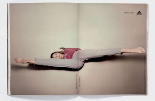


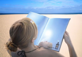


This is pretty amazing. My favourite is DHL one. So simple though effective. It would be great to see such campaigns more often.


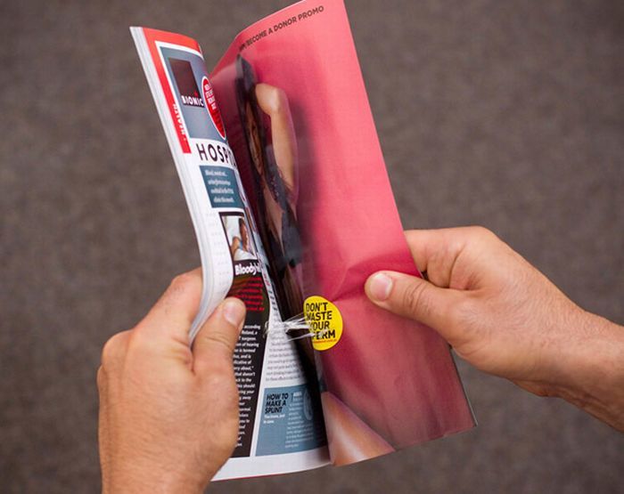


This is pretty amazing. My favourite is DHL one. So simple though effective. It would be great to see such campaigns more often.
Saturday 12 March 2011


Subscribe to:
Posts (Atom)