Thursday 17 February 2011

Website


Website

Address: eugeneptr.com

There was a PPD session based on website creation and how website should look to stand out. Couples of websites made by the previous years graphic design students were shown as examples. Some of them were very interesting. But the only feature I disliked about them is that they all were made according to one template. I mean they all were different but boring. That very moment I though my website would be totally different, a mess probably, but totally different. Come on, we are creatives, we should stand out.  According to Dave Trott: “You should be a “x” in a row of “0”, to be noticed, even if it is stupid.” Another thing that I know is that you should trust yourself  in order to create and to develop your own style or you’ll be similar to other and it is worse. So I have started with the creation of front page. 

Here it is:


I have used a Cinema 4D program to create those objects. I put some real textures on metal and wooden parts of pencil. It was fun and it was the first time I used Cinema 4D. Learned it according to tutorials on YouTube. Cool program, but complicated. Finished the image in Photoshop.

Second picture of website was inspired by Jif lemon brief we had. I used similar piece of paper to put a logo on existing campaigns. You can find this campaign on my website.


On this page I decided to place intro to my website. Here you can also see the doodle characters/drawings that went through the whole personal branding later.

This is my skills page. Later you can find similar corner pockets for images in my PDF portfolio/CV.


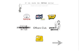
This is my portfolio page. Every page is branded with my personal key logo. I chose grey colour in order to prevent any distraction from the images.


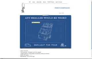
One of my campaigns.

By the way I edited it according to the critics I have received and now I like it better.

This is page with a TV commercial that L.A. and me have created.


This is my contact details information page.  I have used Michelangelo’s touch to play visual with words.


Tuesday 15 February 2011

Second design of a business card


Second design:

I have finished my website. It appeared to be very colorful, fun, with small doodle drawings. I decided to use those small creatures on my business card as well. So it is quiet different but it should stand out. I will use TIFF file to print it as it was created basically in Photoshop. It is double-sided.


I made a keyhole on the backside of it with association to my key logo. It will say that me/my logo is a key to everything and that there is more behind this door. In addition it should add some mystery and interest to my business card. Doddle drawn characters will depict curiosity. The drawings would be made on a wrinkled paper texture to make it more casual. The whole concept of doodle drawings, torn paper and handwriting is based on the idea generation process. There is always a lack of blank paper or laptop when idea pops up and you have to write it on napkin, hand or torn piece of paper. Doodles are a part of thinking process as I draw them on the fields automatically while browsing for ideas in my head. Handwriting is also casual an simple way to communicate. Today the world is so digitalized that its nice to see handwritten text on an old yellowish paper with a marks made by coffee mug.

By the way, all those doodle creatures could be found across all my personal branding: portfolio/cv, business cards, letter heads and website off course.

3D key logo

Today I would like to show you some results that iI have received with 3D modelling of my logo. You can find the flat 2D image of my final logo in previous posts.

So here it is:

Tissue-pack marketing


A man hands out advertising tissues to passersby in Tokyo
Tissue-pack marketing is a type of guerrilla marketing that is a phenomenon in Japan. Companies use small, portable tissue packages to move advertising copy directly into consumers' hands. About 4 billion of these packages of tissues are distributed on the streets annually in Japan—largely outside of subway stations. This industry generates sales in the range of ¥75 billion annually.

Benefits


A variety of advertising tissue packages
Where the more traditional flyers are often discarded without being read or simply not accepted by the consumer, the same is not true of advertising tissue-packs. The most important reason for this is because the tissues add functionality to the advertisement.

This functionality has several benefits:

·      Gets the ad into consumers' hands

·      In a recent Internet survey of over 100,000 Japanese consumers conducted by Marsh Research, 76% said they accept free tissues. This is a much higher rate than either fliers or leaflets.

·      Gets consumers to read/look at the ad after they have accepted it

·      In the same study referenced above, of those that accepted the tissue-pack, slightly more than half of the participants said they either "definitely look" or "at least glance at" the advertisement.[1] One possible reason for this increased statistic when compared to fliers is that consumers were hoping to find coupons or special offers packaged inside with the tissues.


·      Helps consumers to retain the ad and its message

·      The advertisement on the package is more likely to be retained by the consumer because they are being consistently

Monday 14 February 2011

First design of business ca


This is my first design of a business card. I used that funny logo and a “Creepy Face”. The idea was fine, I think. Nice words that describing as a background, smiley face,( if to look on a small scale of a business card)


However I like the combination of colours and I always dreamed about double-sided business card. I think yellow-white-grey-black – works.

Saturday 12 February 2011

Creepy Face


Business card

Size: 8.5x5.5 cm

Ok, so together with my strange pee logo I have also created this “piece of art”), my face made of nice words about me. I thought to sell/brand myself with such extraordinary way. This episode has a funny story behind as well. So I spent a night working on this “masterpiece”. Firstly everything, as usual, started with idea. I decided to try playing with words and shadows. The good word with synonyms needed. Thesaurus helped a lot. I browsed some good positive word and it’s synonyms. However the words were not enough and I didn’t want to repeat the words I have already used. There were antonyms also. I took antonyms just to try and see how it going to be. The result was pretty good. I liked it and I was so happy with it that I totally forgot about antonyms that I have used. This picture was posted on one of the main pages on my website and on business card. I was proud of myself. Once I was checking my website and I have noticed a strange and sudden thing. The front cheek of my wordy face was created with a use of word “mean” and it is together with other good words about me. What makes it even worse is that it was the biggest word on my face and just under that word, there was another “wicked”. It was a nightmare. Nevertheless I have managed it and the word “clean” was created from ”mean” and “gifted” from “wicked”. Creative thinking works!) I used letters from other words on my face. Then I showed my “wordy face to Neil(my tutor) and couple of more people. They all said that face was creepy so I had to delete it.


Thursday 10 February 2011

Something else about color


Something else:

I was walking that day and I reached a cross of the streets. Cars were rushing in one unstoppable flow. It was very dangerous even to think to cross the street on red colour of traffic light. The very second I noticed red my body intuitively stoped.  I was thinking about colours. Suddenly thought came to my head: “What if someone from middle ages appeared here in our century and that someone faced this overcrowded with traffic street. I think the speed of big moving objects would give a sense of fear and will prevent that person to cross the street. However would that human being react accordingly when the red light will change to green? Will the color make its job or it gained too much meaning in our century? Is it so instinctive that red is danger, as it related to blod probably.  Then green what? Fresh? Nature? Why go?

Colours and their meaning


Colors are the life of any type of graphic designing. Without effective colors it is nearly impossible to design a winning brand identity. Every color has its own meaning and each color describes different purpose and idea. One must take care of the selection of the color that it should exactly communicate about the brand and company’s mission and vision.
Here I am going to define basic meaning of some essential colors. It is necessary to have inner knowledge of colors for perfection in graphic designing, and it is also important for a designing professional to lean the meaning of these colors.
RED:
Red is a color of blood, it means it is a color of life. It is one of the most popular and warmest among all other colors. King of flowers ‘Rose’ is red, and red is chosen for the bridal dress in most countries.
Red shows energy, strength, love, passion, romance, warmth, excitement, blood, desire, enthusiasm, danger, joyfulness, speed, courage, prominence, intensity etc.
For businesses red can be used for portraying passion, excitement, and attention. Red can bring enthusiasm to your brand.
BLUE:
When you see blue, you feel like relax and cool. Blue is one of the coolest color. The sky is blue, the ocean is blue. Everything which makes you feel comfortable and relaxed is colored blue by the nature.
Blue portrays creativity, wisdom, gentleness, calmness, trust, loyalty, intelligence, devotion, confidence, comfort, ideas, harmony, friendship, patience etc.
A business can use blue to represent loyalty, confidence and trustworthiness. Most businesses use blue to build customer loyalty and brand reliability.
GREEN:
Green symbolizes the nature. Natural things which give your mind comfort like grass, fertility is in green. Balanced personalities prefer green. Green also shows good health and fortune.
Green typifies success, fertility, growth, endurance, freshness, nature, immortality, environment, good luck, youthfulness, safety, contemplation, joyfulness, hope, dependability, friendliness etc.
Companies often use green for food and health products. Green can represent healthiness, plentifulness and dedication.
 PURPLE:
When red and blue are blended, the purple is formed, so purple has the qualities of both the red and blue. Purple is cool like blue and powerful like red. This color gives the essence of spiritual fulfillment, and symbolizes magic and mystery.
Purple depicts spiritual power, knowledge, dignity, influence, royalty, mystery, enlightment, extravagance, sophistication, cruelty, arrogance, empathy, imagination, déjà vu, fame, sensuality, luxury, elegance, majesty etc.
Purple is generally used for premium service businesses. Purple represents businesses as wise, celebrated and sovereigns.
YELLOW:
Yellow is a representation of brightness and purity. Yellow is favored by intelligent people. Yellow is usually used for showcasing creativeness and intellect. Sun is the great example of yellow which lightens the earth and humankind.
Yellow represents brightness, light, intelligence, imagination, social energy, respect, shine, happiness, optimism, purity, honor, perception, understanding, dishonesty, wisdom, betrayal, curiosity, mellowness, confidence, jealousy, mellowness, summer, philosophy, glory etc.
For businesses yellow is a color of happiness, warmth and awareness. Companies use yellow to bestow feeling of relaxation.
ORANGE:
Orange reflects the physical and mental comfort. It is a color of power and healing. Thoughtful and sincere people usually admire orange. This color is a mixture of red and yellow, so it has features of both the colors.
Orange symbolizes enthusiasm, vibrancy, vitality, balance, justice, flamboyance, attention, attraction, endurance, steadfastness, fascination, heat, determination, autumn, creativity, encouragement, social structure, uninhibited, fun, kids, youth.
Vivacity, potency and playfulness can be portrayed through orange. You can use orange if you want to display youthfulness and liveliness to your customers.
WHITE:
White is a reflection of all the colors. It enhances the presence of all other different colors. White means peace and prosperity. Brides wear white because it represents purity and virtue.
White exhibits peace, purity, spirituality, virginity, goddess, innocence, simplicity, precision, cleanliness, winter, snow, sterility, fairness, safety, innovations, holiness, feminine, chastity, positivity etc.
White can be seen in medical and health services or in women’s products. Purity, cleanliness and youthfulness can be pictured through white.
 BLACK:
Black is opposite of white, but it works like a counterpart of white. White and black both make the greatest combination of all time. Black mostly refers to as darkness, death, fear and horror, but on the other hand it represents the corporate culture, power, credibility and seriousness.
Black means power, formality, classy, protection, sophistication, wealth, elegance, fear, depth, sadness, compunction, empowerment, bad luck, authority, reliability, prestige, seriousness, binding etc.
Most corporate and high-end branding is done through black. Black gives the feeling of credibility, elegance, power, and strength.


D and AD talks in Newcastle 2011


Today I attended two D and AD seminars. Those two seminars were held at Northumbria University. First one was read by Rhiannon James and it was basically about how the D and AD student awards would be judged. Some examples of last year works were shown and discussed.

The judgment process consists of two parts. In the first par juries browse work quiet fast. They use about 30 sec. per each work and if it is enough for work to say for itself they leave it for the next round.
 In the second round juries studies those selected works more careful to find the best ones.

Among the juries are: Head of creative 44%; Head o design 23%; Head of marketing 9%; and others.

The main points that concept should relay on are:

It should be a good idea;
It should be well executed;
And it should be on a brief.

Main features: impactful, entertaining, and useful

Mainly juries are looking for a talent and future perspectives that is why it is very important to prepare your idea explanation presentation as well as the final concept.

However we were shown one advertisement that participated last year. It was a video made for MTV. The idea was to show how to cook a cake and then to play music with the use of it like if it was a DJ’s equipment. The concept was great and execution even better but there was tiny thing that would probably spoil everything. In the brief it was mentioned that it should be a poster but not a TV commercial.) Lol. Nevertheless D and AD juries loved the campaign so much that they gave a prize to that ad anyway.


The next talk was with Rodrigo Sobral, the Creative Director of The Mill London. He started his talk showing pictures depicting social life at ancient times when tribe people were gathered by their leader near the fire place and stories were told.

He said that those times were the beginning of advertising era as an advertising  business Is mostly about storytelling.

Then he showed Nike campaign that was created by “The Mill London”
It was amazing. One of the best advertisements I have seen. The idea and execution were on the very professional level. However it was quiet long, 7 minutes.

Famous “Hovis” TV commercial was also partly created by “The Mill London”

Here is the links to these ads:


Tuesday 8 February 2011

Logo 2


Nevertheless I decided to stick to initials idea. I played with letters for a while and this is what I have got. I like it much better. It has a meaning in addition to the design and this meaning is no related to toilet processes.)  Here it is:


Very simple – a key made of my initials.

Overall concept was made on a doodle (small drawn characters (mostly made by pen) basis. So logo would be in blue. This is the most secure colour . It is calm, cool, professional and it is a colour of pen. Doodles would be drawn in blue as well.

My first logo was…strange.)


My first logo was…strange.) Here it is.


Funny thing is that I was so happy with this log that I didn’t see a funny side of it. It was so into advertising to m. Those yellow and dark grey colours, then my initials, everything is so cool and professional. The word creative made it even more professional. Only when my cousin saw it for the first and time she said; “Really,… Creative Pee?” only then I have realized how funny it was. Lol) It reminds me a brief that we worked on with L.A. It was a brief for Officers Club. The proposition was to advertise manly clothes to men 18-24 age old. One of the first our  “amazing” straplines was “What’s your package?” We were talking about clothes as a wrapping to human’s body. We were so happy with the idea that we went to our tutor immediately. She looked at our idea then to our happy faces and she asked one thing that ruined it totally and made us stupid. She asked: “Do you realize the sexual context of this line?” Yeah and just that very moment everything got clear. Funny.)