Saturday 18 December 2010


At last two ideas were selected for further execution. I have misunderstood the main points of the brief that is why I have struggled too long with idea generation process.  Neil have helped me a lot with the first concept. He suggested me to use the famous British proverb/ saying: “Walk the walk, talk the talk” as a strap line to my strategy. I didn’t know that proverb/saying before.


Here are the concepts and explanations to them:


1ST  CCONCEPT


Basically the idea was created around well-known saying “walk the walk, talk the talk”. Here is an example of how that saying could be used: “Don't talk the talk if you can't walk the walk.” It means: talk is cheap, but can you follow through with action?

 Walk the talk would be a shorter version of that expression.

This proverb generates a positive attitude, as it is life wisdom.  It suggests to do things more and to talk less. Basically it is appealing not to talk about those shoes much but to try them and their quality would walk the talk.

As a mater of fact it is a quite strong expression that even could be associated with such a brilliant slogan created for NIKE “JUST DO IT” but with a deeper meaning and cultural recognition (as it is a well known British saying/proverb).

The campaign was inspired by the look of “Casual” subculture but with funky cartoonish motives. Hooligans style is a bit aggressive that is why it should be diluted with a warm colors and funky patterns. Commonly the hooligan look would be used on the campaign image as it is very popular now, it is international, it has no class or status orientation, it is related to well known popular cloth brands, it is casual but still football orientated (that will leads to an UMBROS image as a football icon but won’t harm a casual feel/perception of the product.

The peculiarity of this campaign is that there is no strap line. It is based just on visual communication. On the picture one may see a guy walking on a speech bobbles or speech lines. So mainly it is reciting the proverb with the us of visuals.

Campaign is also using visual elements of a shoe to make it recognizable and associative.  For example on the first print background flowers patterns are made from a branded shoe soles. On the second picture pattern is made of a logo’s part - diamond. Third picture is decorated with the use of circles that could be found on a sole of the shoe.

Most of the curves in the campaign are copying famous “A FRAME”.

Also those visual elements would be used in the design of a packaging for this product and as a design patterns for a special edition shoe. Boxes would be covered with circles, diamonds, “A” Shaped curves and shoe-flower patterns.  They would be colorful and bright.  “Just Walk The Talk” slogan would be also on the packaging and on one of the shoe’s sole side.  “A” letters would have a shape of a famous “A frame” curve.


2ND CONCEPT

CRAFTED FOR LIFE

This concept represents an original “A FRAME” shoe made from icons of the things that are used in everyday life. In such way UMBRO will show consumer that its new product is designed for every day life. The strap line “Crafted For  Life”  will complete the  message of an advert.

The “Crafted For Life” campaign will consist of two parts. First part is a teaser that would be shown for about a month on bill-boards, in magazines and as a banner on websites. Teaser part will use the shoe made of icons idea. In a month the image will change. It would be a photo of the original shoe from the same perspective of view as it was on “icons made” one.  Strap line wouldn’t change. It would be the same “Crafted For Life” on both cycles of the advertising campaign.


The goal of such unusually executed advertising campaign is to attract consumers’ attention towards the product and brand in common by its creative and unusual execution.

The packaging will use the same icons idea but inverse. The entire box would be covered with the icons of things from everyday life. The only empty spot would be in the middle of the box’s lid.  It would be shaped accordingly to the shoe outlines.  It is a smart and fun way to play with the icons pattern and to extend campaign idea. This icons based pattern would be also used in the design of a special edition shoe. Whole shoe or some of its parts would be covered with that pattern. This will also relay to the main campaign’s idea.


Saturday 11 December 2010

Clients meeting arrangement


One of the module’s tasks was to arrange the meeting with a “real” client and to write a proposal. Neil has given us some contacts of professionals working in advertising industry at Newcastle. My contact is Richard Short. Today I wrote an e-mail asking him to evaluate on my ideas.

Friday 10 December 2010

Neil Critics

Today I have presented my ideas to Neil. As it appeared to be my ideas didn’t meet the brief’s tasks. This product should be a changing point in consumers’ perception of the brand being just sport orientated. This is the main problem of the brief.

Saturday 4 December 2010

D and AD Life Briefs


Today we have got a new task.  The challenge was to browse among D and AD and YCN briefs and chose one for execution.  There were a lot of famous brands there such as: “SEGA”,  “DIESEL”, “OXFAM”, “BODYSHOP”, “TED BAKER”, “TUBORG”, “UMBRO”, etc.  There was even “The Walt Disney” brief. In that brief it was asked to create a funny and charming character. It sounds fun for me as I very passionate about drawing cartoons. However I have decided to take an “UMBRO” brands brief. I really like this brand, as its products are well crafted and rather cheap.  In addition I feel that I have understood the main points of the brief and will be able to create a nice campaign.

Here is the “UMBRO” brand brief:


Thursday 4 November 2010

Evaluation Officers Club brief


Finally we have finished the Officers Club commercial. It was presented in class today.

Evaluation

This task was very unusual compared to the things we did before. In addition to the creative process of idea generating we had to write a script, find actors to perform in the commercial, learn basic filming skills, draw storyboard, mix music and voiceovers and finally we had to edit it with a “Premier Pro” video editing program. The video editing was one of the most stressful parts of the whole process as I managed to teach myself how to use this professional program only in two weeks just using video lessons on YouTube. What I have learned about myself from this experience is that I am a persistent person that I can work with deadlines and stay calm under pressure. The project was a great success and received highest reviews from all the tutors and my classmates.

Saturday 30 October 2010

Editing video for Officers club commercial


Today I have spent whole day editing all the videos we made for the commercial and I think I will spend all night as well.

Friday 29 October 2010

Learning Premier Pro Program


I like very much the idea that we came up with. That is why I think that there are not enough tools in the iMovie to create all the necessary effects. I have decided to learn new professional program for video editing. Its name is Premier Pro and it is one of the main Adobe’s creative suite programs. I have spent more than two weeks browsing web for lessons. Main source for information about Premier pro was YouTube channels and creative blogs. 

Thursday 28 October 2010

Voiceover


L.A. has written a script for our project (Officers Club commercial) and now we need a native speaker for voiceover. Richard from audio production proposed his help. He decided to create a soundtrack for our commercial as well.

Wednesday 27 October 2010

Day 3 of filming for Officers Club commercial


This day we spent searching for Parcour guys.  We found them in the center of Newcastle city. It was a great experience and we filmed a lot of useful moments and tricks that would be used in final TV ad.

Tuesday 26 October 2010

Second day of filming


Second day of filming. It was decided to engage some dancers from “Dance City” to participate in our commercial.

We went there but unfortunately were rejected by the administrator. It was a great disappointment but then we found those guys on one of the floors of Dance City. They were dancing just in the hall. We placed our camera on tripod  and filmed them. It was a success.

Monday 25 October 2010

First day of filming


We were filming all day long. It was rather cold and windy outside but Sun was shining all day so we have got nice video cuts. It was decided to film my eyes for the first part of the commercial. Sunny weather and wind have helped to create that dreamy atmosphere. Basically we are satisfied with the todays filming process.

Saturday 23 October 2010

Storyboards


Today I have drawn a storyboard for Officers Club brand commercial. The drawing experience on the Wacom digital tablet was amazing. I am very happy with this product. Storyboard is attached to this post.


Thursday 21 October 2010

WACOM Bamboo


Today I have bought Wacom Bamboo special edition (m) digital tablet. I think this is one of my best investments ever. It is small but with a good sensitivity and it could be used as Apple’s famous touch pad. Basically one can use fingers to zoom, rotate or scroll. The design is amazing as well. I am strongly recommending this tool to everyone. 


This gadget would be very useful for storyboard creation.

Wednesday 20 October 2010

Officers Club idea

At last we came up with an idea.
The inspiration for the idea came from a Russian standup comedian. He was talking about personality and where it could be found in ones body. His speech was about consciousness and what is given at birth and unchangeable. Genetically person gets most of the things from parents. Most of the things person gets from parents genetically. Which part of body is really you? So basically you are is what you think, how you live and look.

Tuesday 19 October 2010

Officers Club Brief


Client: Officers Club.
The proposition: Change consumer perception of the brand. 
Target audience: Young men 16-24.
Media: TV commercial.
Mandatories: Officers Club logo. 30 seconds limit.

Friday 1 October 2010

Jif project Evaluation


The project was very challenging as we were unfamiliar with the briefs product and brand in common. There was a lot of trash ideas that we didn’t satisfied with. Nevertheless we came up with a risky but creative one. I was so excited while presenting that idea to Neil that I could barely breath and I was shivering from time to time.  However our idea was accepted and Neil was pleasantly surprised with our last minute work. Presentation was fine and we have got a lot of comments towards our work from the classmates.

This experience gave me a taste of challenge and risk of the industry I am passion about. To tell you the truth the taste of success and appreciation is so sweet. The lesson I took from this module is that you should never give up, should fight to the end. 

“JIF IT” game


This is a “JIF IT” game. The main goal of the game is to Jif flying objects by taping on them. Not all the objects should be taped - only those that can be used with a lemon juice. If the wrong object would be taped, the red “x” will appear and then there is going to be a screen with an explanation why that object can’t be Jifed.

Jif It Stamp


This “JIFF IT” stamper would be given if a certain amount of stickers from a Jif container would be collected. This stamper should be used to stamp things that could be Jifed. Those pictures should be uploaded to a “JIF IT” website and the best pictures would get valuable prizes.

Ambient Jif


These are examples of an ambient “JIF IT” campaign. The idea is very simple - just to use other ambient adverts to create Jif ads by covering them with a “JIF IT” stamp. Graffiti and other pictures that can be Jiffed would be in use as well.

Jif It web site


This is a “JIFIT” website. There is a lemon tree with a Jif containers falling from it. Next page is dedicated to the Jif forum where all the latest news would be discussed and new pictures of “JIF IT” campaign would be uploaded. There is a menu bar in the top part of the page. There it is possible to choose whether to look for the recipes with the use of Jif or browse for the new Jif ads.

Crazy Jif idea, at last!)


At last we came up with a nice and creative idea. It is a bit crazy and this kind of advertisement is forbidden in U.K. but as our tutors have said: “While you are students it is ok to experiment.”

It is only 24 hours left till the presentation and it means that I will spend those 24 hours Macing everything up. Good luck to me).


The idea was to take existing successful campaigns of the brands with similar properties to Jif and to put Jif stamp over them. The slogan Jif It would be used across the campaign. That will say that Jif can do the same but cheaper. Jif logo would be virtually attached with the use of scotch to those campaigns images as if it was a real piece of paper with logo. The word on a sticker will specify the purpose of use according to the campaign. We will use print media for posters. We will create web site iPhone game and ambient advertising as well.


Wednesday 29 September 2010

Design Event 2010


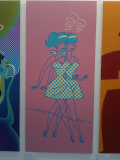
Today my friends and I, we have visited a design event that was held in Newcastle. The event consisted of several exhibitions of modern art and graphic design samples. First place that we have attended was Newcastle Art Centre.  It was a graphic design exhibition there. Pictures were divided into different sectors.

Here you can find few of them that I liked the most:


Also there was a part of the exhibition and a special activity on the second floor of the Newcastle Art Centre.  There was a table covered with paper plates and a certain number of colorful markers. People were encouraged to create their own design of a paper plate. Unfortunately I had no time for that activity as my friends were waiting for me outside, but I have noticed a lot of nice plate designs there.

Next was Electric Ship gallery (shop).

I was amazed hoe this shop managed to be both: shop and gallery at the same time. First room of the shop was dedicated to the clothes and goods for sale; second room was full of paintings. Paintings were everywhere: on the walls, in the stacks in the middle of the room, behind the walls. I was very impressed by the author’s style. The main accent was made on hands. Those hands were a bit disproportionate however they looked suitable for the bodies that were depicted on the images. The line was so true and tender.  As for me those pictures were full of some kind of Indians tribal mystery but with a modern urban sense.


Afterwards we had a launch at the Stateside café. I have never been there before. The style was made as if it was a real American diner. The funny thing happened with me there. As usual I have ordered a medium cooked stake. In 15 minutes waiter have brought it to me. It was very dry and I couldn’t even cut it. I have tried to chew it and I didn’t succeeded. It was just overcooked. So I explained to the waiter that stake wasn’t cooked according to my order, that it was dry. The waiter apologized and promised to bring another one medium cooked. He did like he said. Ten minutes later another stake was on my plate. It was juicy and fresh… however it was probably too juicy and too fresh. ). Now it was undercooked and I have struggled with chewing it as well. It was funny.


Here you can find a picture of the second stake:


The last exhibition we have attended today was at Northern Stage and its name was Northernness: Set of Drawers”. Main theme of the paintings was Northern part of U.K.  There were few artists from Newcastle city.
I really liked one painting. It was a depiction of the tree made in pencil and ink. Its branches were covered with sneakers shoes. There was a “Converse” logo on one of the main ones. This brand is one of my favorite brands. Probably that small thing made a main impact on me.


Here you can browse some pictures from the exhibition: 


Tuesday 28 September 2010

Jif Lemon creative process

Me and my team partner LA we just finished the last creative exercise. We did associations, Thinking hats and the last one was "Ping-Pong" exercise. Few ideas were created out of it but they are not that good as we wish them to be. They are pretty standard.  For example: Jif Lemon as a cartoon character dressed in different national costumes. It  wears traditional suits of different nationalities and it is eating dancing, or even drinking in the style that suits to this or that culture. By this idea we are trying to say that Jif could be used for cooking a wide range of dishes of different nationalities. Also we thought to attach short and useful  recipes to the Jif Lemon bottles. Those recipes would be gathered from different parts of the world and they all would use lemon juice.


Monday 20 September 2010

Struggling with the brief


The brief appeared to be even more complicated and challenging as I thought before. My team partner L.A. and me, we are currently struggling with an idea generating process. All the ideas that we came up with appeared to be rubbish. They are not creative and we are unsatisfied with ourselves. In addition our tutor Neil said that he expected better brief solving executions from us. Also he said that this probably one of the projects that is going to be in our portfolio. Now I don’t even know what to do as it is only one day left.

Friday 17 September 2010

Jif Lemon Brief


Client: Jif Lemon
The proposition: Increase sales between March and January/to push Jif out of season of Pancake Day.
Target audience: Housewives and young people.
Media: Any kind of media.
Mandatories: Jif Lemon logo, brand colors.

Today we have got a new brief. I didn’t know this product and brand before. It means that module would be pretty challenging task and it will need a huge research to be done. As understood this brand makes the most sales on a Pancake Day holiday. It is very traditional product with a long history of brand-to-consumer relationship.

First thing I am going to do is to ask my classmates and tutors all the information they now that is related to brand. It would be a primary research. Also I will buy the product to study it carefully (logo, packaging, taste etc.).

Wednesday 15 September 2010

Jif Lemon

So the first project has come. Brand's name is Jif Lemon. This is a concentrated lemon juice in a yellow plastic bottle that has a shape of real lemon.

BRIEF:

Jiff lemons are plastic lemons containing real lemon juice. Their sails peak at around Pancake Day.

Our task is to make people aware of Jiff at other times of year as well. We should create a campaign that uses traditional print media as its basis, but then extends across at least 2 other forms of non traditional media.

This task is a bit complicated for me and for my team partner LA as we are not used to such kind of spice. Another thing is that Jif Lemon is very traditional product in U.K. It was used as a Pancake spicing for ages and know we have to break this stereotype.

Monday 13 September 2010

Second Year

So this is it. My second year of study just have began. I am a little bit worrying as it is the final year of my Foundation Degree at Newcastle College. As I know this year would be dedicated for creation of portfolio of works for the next stage (work placement or final bachelor year). Also we will have to get an internship in one of the local agencies. This would a part of studying process and would be marked.

Another curious thing is that we have a new tutor. His name is Neil Bestford. (It is probably cool to have word "best" in surname :)). According to the information that was given, he just came from industry. this means that he knows what is what due to the date in the creative business. I think he has a lot of useful connections as well and there will be a lot of professionals from advertising sphere visiting our college studio.

This year should be exciting and I can't wait to start a first project.